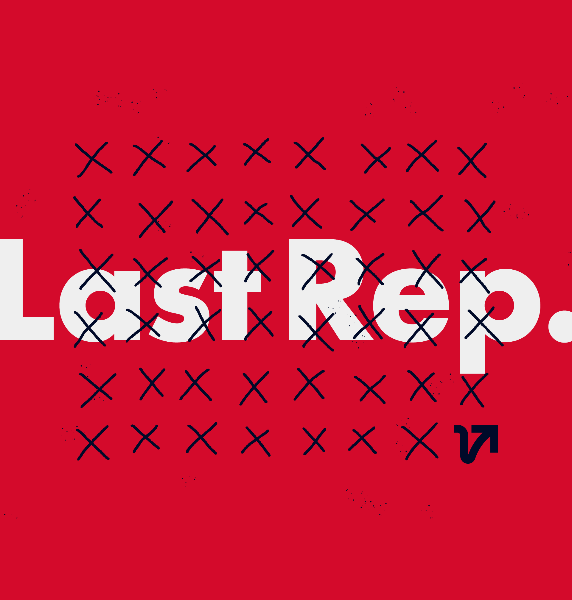
Last Rep.
Art Direction, Visual Identity, Bespoke Artwork
Year: 2019
Client: Last Rep.
Photo: Last Rep.
Summary
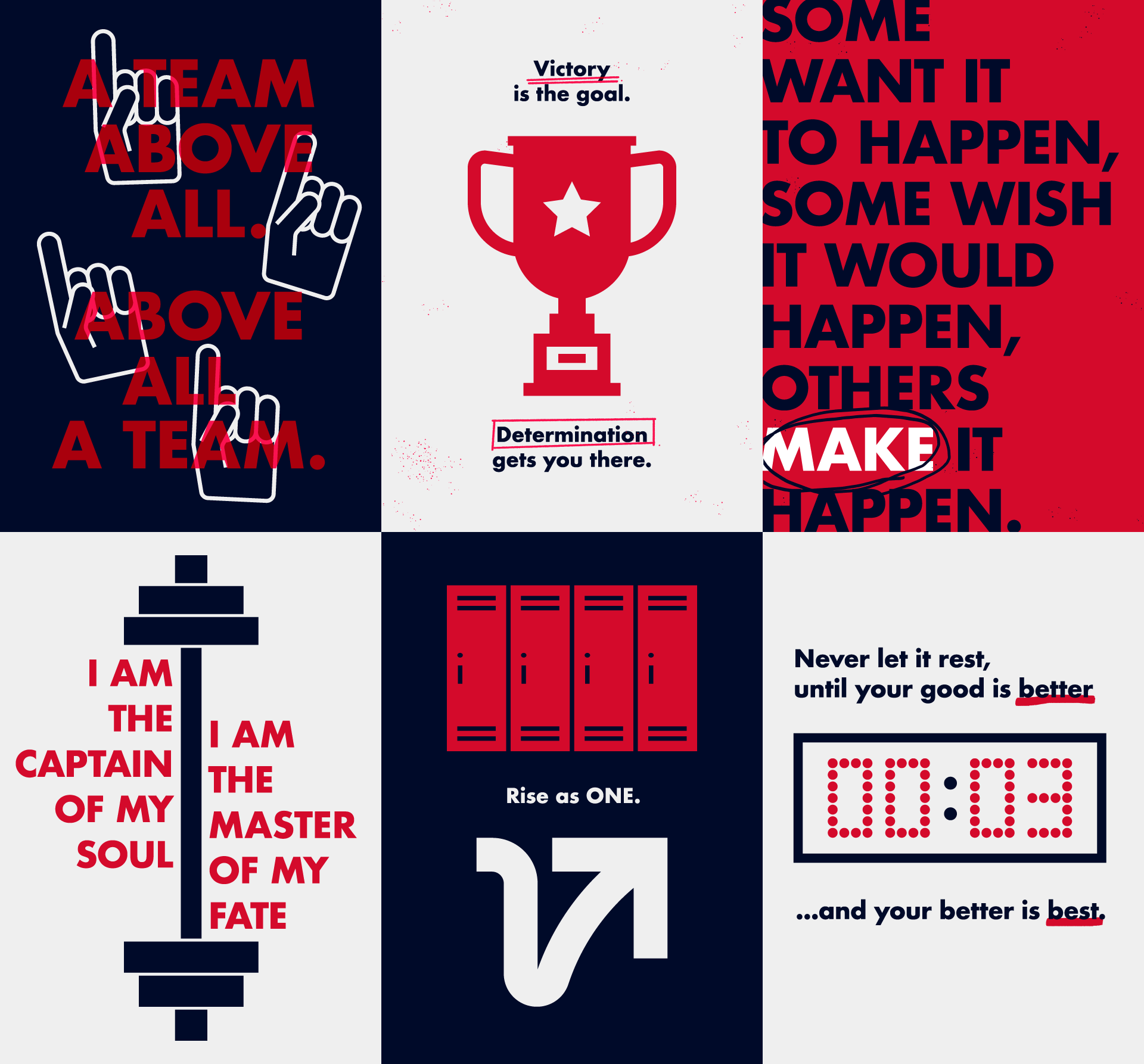
Last Rep. is a HIIT fitness club in Toronto, Canada.
The art direction aims to reflect the brand image inspired by team sports.
Deliverables
Logo
Visual Identity Elements
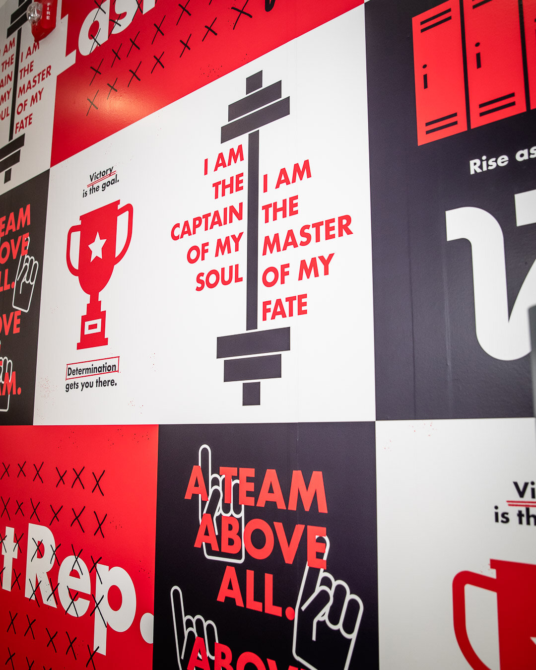
Wallpaper
Last Rep. believes that everyone with a fitness goal should be treated like an athlete. The fitness studio offers unique HIIT (high-intensity interval training) experiences, inspired by team sports. Working with a team goal in each class, customers stay motivated by competing alongside their teammates and coaches, down to the last rep.


The club needed a visual identity which was simultaneously welcoming, strong and sophisticated. Our response was a bold and sleek arrow representing rising motivation.
Taking shapes from the initial letters of the brand name, the first half (the letter L) represents the decline in energy and motivation before the last rep, while the latter part (the letter R) expresses the surge of energy required for the final effort.
Arrow design based on the initial letters of the brand

Wordmark design
Visual Identity Elements